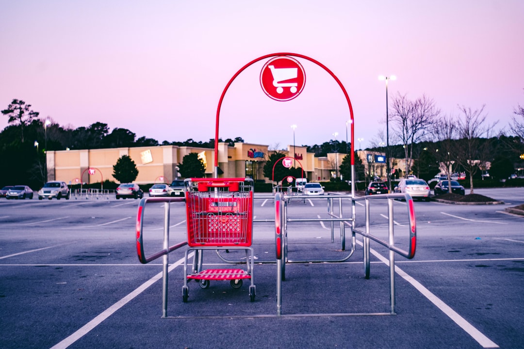
Shopify Cart Drawer UX: 12 Teardowns + Tests
12 real store teardowns, proven cross-sell patterns, and A/B tests for Shopify slide-out carts. Learn cart drawer UX that converts. Join Byte & Buy.

Narayan Chaudhary
Narayan Chaudhary
May 29, 2025

Cart Drawer UX That Converts: 12 Real‑Store Teardowns, Cross‑Sell Patterns, and A/B Test Ideas for Slide‑Out Carts on Shopify
If you are not actively optimizing your slide‑out cart, you are leaving revenue on the table. Cart drawers sit at the moment of highest purchase intent, and small UX details here can swing conversion rate, average order value, and checkout completion in a single session. According to Baymard’s running benchmark, the average cart abandonment rate sits around 70 percent, with extra costs like shipping cited most often as the reason to bail. In 2025 data, Baymard reports 39 percent of users abandon due to extra costs, with 21 percent citing slow delivery and other frictions. When the cart drawer communicates value clearly, removes friction, and suggests relevant additions, it reduces these risks and compresses the path to purchase.
Byte & Buy members asked us to tear down real carts and turn the patterns into testable playbooks. The short version: slide‑out carts that focus attention on a clear primary action, show transparent shipping expectations, and surface only highly relevant cross‑sells win more often. And speed matters too. Deloitte’s joint study with Google showed that a 0.1 second mobile speed improvement increased retail conversion rates by 8.4 percent, reinforcing how performance and cart UX work together. You will find actionable examples below, plus A/B ideas and build notes for Shopify.
Why slide‑out carts lift performance
Slide‑out carts reduce context switching by letting shoppers confirm, edit, and pay without leaving the current page. The convenience aligns with how users browse on mobile and helps contain distractions that creep in when routing to a separate cart page. The effect is amplified when you pair the drawer with accelerated checkout. Shopify’s own data indicates Shop Pay produces a 1.72x higher checkout to order rate than standard checkouts. If you expose Shop Pay, PayPal, or Amazon Pay right in the drawer, you remove steps and give buyers familiar one‑tap paths.
Relevance of any nudge inside the cart is non negotiable. Baymard’s research on cross‑sells in the cart found that 52 percent of desktop sites show offers that are irrelevant or driven only by generic crowd data, and users quickly learn to ignore everything if even one suggestion feels off. The lesson is to tie any recommendations to the item in the cart and the use case, not generic popularity. Properly executed, cart cross‑sells can increase order value while being perceived as helpful service rather than a sales push.
The anatomy of a high‑converting cart drawer
A great cart drawer is quiet and focused. It confirms the add, previews the total, and makes the next step obvious. The secondary layer supports that decision with clarity, not clutter.
Primary action above the fold. On mobile, your checkout button should be visible on open, not buried under promotions or chat widgets. The ReConvert team’s examples highlight Allbirds placing Shop Pay, PayPal, and Amazon Pay prominently in the cart drawer, reducing friction by design.
Transparent shipping messaging. Because extra costs are the top abandonment reason, a free shipping threshold bar and realistic delivery timelines calm anxiety. When Rothy’s shows “Add €20 to Receive Free Shipping” with a progress bar inside the drawer, the incentive is concrete and immediate.
High‑relevance cross‑sells. Think batteries for electronics, filter packs for coffee makers, or matching accessories for apparel. Baymard advises prioritizing compatibility items and theme‑level relevance, and to avoid fixed counts of recommendations. If you only have one truly relevant add‑on, show one.
Trust and reassurance. Star ratings, review counts, guarantees, and privacy‑safe payment badges all build confidence. Conversion‑focused teams like Fuel Made have A/B tested adding trust language directly in the cart drawer and observed modeled improvements in conversion and checkout completion.
Speed and stability. Cart drawers run on AJAX. You do not need heavy scripts fighting for that precious real estate. Google and Deloitte’s speed research is a reminder that micro‑delays here will be felt as friction.
For deeper language ideas during checkout and pre‑checkout, the Byte & Buy guide on Checkout Copy That Converts on Shopify shows 25 microcopy wins you can reuse in your cart drawer.
12 real‑store cart drawers to copy this quarter
We picked live examples called out by practitioners and technology vendors to highlight concrete patterns you can apply today.
Allbirds: express payment in the drawer
The Allbirds cart drawer surfaces Amazon Pay, PayPal, and Shop Pay alongside the standard checkout button, a detail the ReConvert team uses to illustrate frictionless payment selection. Offering accelerated methods directly in the drawer speeds completion for loyal users who already trust those wallets. When Shopify’s materials note Shop Pay’s 1.72x conversion lift, reducing taps to reach it is an obvious win.
Rothy’s: progress bar for free shipping
Rothy’s uses a clear progress bar and remaining amount message in the drawer to nudge shoppers toward the shipping threshold. Because Baymard reports extra costs as the top abandonment driver, making the path to free shipping visible while suggesting logical add‑ons is a powerful, ethical push.
Beardbrand: low‑friction shipping protection
Beardbrand offers a small, priced add‑on labeled Protect My Order in the cart drawer, shown in ReConvert’s examples. This kind of reassurance is a low‑cost decision for the buyer and pads revenue per order without interfering with the primary path. Keep the copy literal and place the toggle near the pay button for visibility.
Cuts: membership upgrade at the point of decision
Cuts promotes a VIP membership directly in the drawer, listing tangible benefits like store credit and free express shipping. As ReConvert observes, this converts a one‑off buyer into a relationship. If you test this, ensure the offer is clear on immediate value within this order, not just future perks.
United By Blue: social proof plus relevant recs
United By Blue shows review counts, adds short recommendation blocks, and reiterates its environmental mission in the drawer. Pairing social proof with a brand value statement keeps the experience confident and on brand. Baymard’s advice to label recommendations with context, like Inspired by Your Picks or Frequently Bought Together, also applies here.
Ratio Coffee: fast, edit‑friendly confirmation
ReConvert highlights Ratio Coffee’s clean drawer that emphasizes quantity edits, remove, and totals with minimal decor. The lesson is to make the confirmation action immediate and reversible. Do not trap users in full page detours just to remove an item.
Elysian: gift wrap plus a curated carousel
Rebuy’s cart flyout gallery shows Elysian’s side panel with gift wrap and a swipeable carousel of sale items under Perfectly Priced For You. This is a good lesson in how to use horizontal space without burying the primary CTA. If you adopt a carousel, keep the card density low and ensure keyboard and swipe accessibility.
immi: tiered progress and a membership callout
The immi drawer adds a multi‑tier progress bar and a bold membership promo beneath the checkout button. Rebuy notes this design mixes gamification with a clear value trade. If your tiers include a gift with purchase, spell out the exact item and eligibility to avoid disappointment.
Firebelly Tea: subscription toggle and gift message
Firebelly Tea’s drawer shows Subscribe and Save by cadence, gift message, shipping protection, and a two‑tier bar for free shipping and a gift. It is a smart demonstration of layering multiple revenue levers without crowding. If you install similar toggles, default to one‑time purchase and let users opt in to subscription to keep trust high.
Momofuku: on‑brand details and review counts
Momofuku by David Chang keeps a crisp free shipping bar and variant selectors while showing slashed prices and review counts via a ratings app. Rebuy points out that pairing a clear discount presentation with social proof in the drawer increases salience in the moment of decision.
Mixhers: double‑wide cart with personalized adds
Mixhers worked with an agency to implement a custom double‑wide drawer that expands into a breakout menu for personalized cross‑sells. The drawer includes a subscription upgrade toggle and SMS management opt‑in. If you push this far, track page performance and ensure focus order and keyboard navigation meet accessibility standards.
Magic Spoon: subscription emphasis and ratings
Magic Spoon’s bright slide‑out cart makes the Subscribe and Save button large, surfaces star ratings, and keeps a dominant checkout CTA. Rebuy’s writeup of this example shows that you can speak in your brand voice while still following the same conversion patterns as the more minimalists.
These are not hypothetical mockups. They are live store patterns documented in the field. Rebuy’s roundup of cart flyouts and ReConvert’s cart drawer examples are useful galleries to show stakeholders and engineers what good looks like in production.

Cross‑sell patterns that work inside the drawer
Baymard’s deep dive on cart recommendations is clear on two themes. First, irrelevant cross‑sells burn trust and train users to ignore promotions. Second, compatibility and context are king. Their guidance is prescriptive:
Use dynamic counts. Do not render five cards if only one is truly relevant. Show fewer items with higher specificity and confidence.
Prefer complementary items over alternatives. Once a shopper has decided, you risk derailing them if you promote substitutes in the cart. The exceptions are upgrades or version replacements that are a direct step up from the chosen item.
Label the logic. A label like Complete the Look or Essential Accessories tells users why these items are here, which softens perceived pushiness.
Prioritize use case and compatibility. For a camera, suggest the exact memory card and case. For a coffee brewer, surface filters and descalers. Baymard’s examples show sites like B&H Photo and Argos doing this well in the added to cart overlay and cart context.
Apply promo logic. Do not show your private label credit card or financing on a 5 dollar order. Baymard demonstrates how Wayfair varies the presence of those promotions by order size.
On mobile, the smaller viewport amplifies the cost of noise. Keep the drawer scannable and ensure the checkout button stays visible while users scroll adds.
A/B test ideas for your slide‑out cart
Your store is not Allbirds or Magic Spoon, so validate with your traffic. Two agencies have published credible tests that illustrate why. Fuel Made ran a multi‑variant test for Live Bearded and found a slide‑out cart with trust iconography outperformed the legacy cart page with a modeled improvement of up to 18 percent and a checkout completion lift up to 40 percent. In another quick win, Blue Stout removed redundant title fields in a cart drawer for an apparel client and saw a 7.8 percent increase in carts completing checkout. Translate the spirit of those experiments into your roadmap.
Here are focused ideas you can ship quickly:
Express checkout button mix. Test showing Shop Pay and one alternate wallet in the drawer versus presenting three or more. Hypothesis: fewer but familiar options increase clarity without reducing wallet coverage.
Auto‑open behavior. Compare an auto‑opening drawer on add to cart with a subtle toast and a cart icon bump that requires a tap to open. Hypothesis: high frequency adders prefer not to be interrupted.
Free shipping threshold framing. Test displaying the remaining amount versus percent complete and test static copy like You are close to free shipping versus precise math. Hypothesis: concrete numbers outperform vague encouragement.
Number of recommendations. Following Baymard, test one ultra relevant add‑on against three mixed quality suggestions. Hypothesis: one wins on perceived helpfulness and reduced cognitive load.
Location of cross‑sells. Compare recommendations between the item list and below the primary CTA. Hypothesis: below the fold preserves focus on checkout for high intent shoppers and still captures AOV uplift among browsers.
Trust elements. Test adding concise proof points like Free 30 day returns or Secure checkout by Shop Pay next to the CTA. Hypothesis: explicit reassurance increases drawer to checkout clicks.
Shipping protection toggle. Test default off versus prechecked with clear microcopy. Hypothesis: default off maintains trust while the offer itself still converts when framed as peace of mind.
Promo code field visibility. Test keeping discount input hidden behind an Apply a code link versus showing it always. Hypothesis: hiding reduces promo hunting without hurting users who have codes.
Sticky CTA on mobile. Test a persistent checkout bar pinned at the bottom of the drawer. Hypothesis: reduces scroll friction and increases tap rate to checkout.
Drawer width and padding. Test a compact narrow drawer against a wider version that accommodates two cross‑sell cards per row. Hypothesis: wider helps merchandising for larger catalogs but must not hide the CTA.
If you are new to testing on Shopify, tools like Intelligems and Convert are frequently recommended by practitioners for clean implementation on theme‑based storefronts. Fuel Made points to a baseline of roughly 1,000 monthly transactions to reach significance and suggests running tests for at least 2 weeks unless you have very high traffic.

Build it on Shopify without breaking flow
Most modern Shopify themes expose a cart drawer or allow you to enable an AJAX cart in the Customizer. If you prefer a prebuilt solution for merchandising and targeting without code, the ecosystems around Rebuy, ReConvert, and other reputable upsell tools can help you ship progress bars, GWPs, and in‑drawer recs fast. The key is to keep your drawer lean. Load only what is essential and defer heavyweight personalization or reviews scripts when possible.
Accelerated checkout placement. Shopify’s public claims around Shop Pay’s 1.72x lift are too strong to relegate it to the checkout page only. Expose the wallet in your drawer and test its order alongside your primary CTA. Shopify’s own blog positions Shop Pay as a best converting accelerated checkout, and you should treat it that way.
Content and copy. Borrow from your PDP’s best selling points to reiterate in the cart drawer. Our teardown of 100 Shopify PDPs shows patterns like concise benefits and visual review cues that transplant well to this space.
Pricing and bundles. If you are nudging users to reach a shipping threshold, be sure your pricing psychology supports it. Our 2025 DTC Pricing Playbook covers smart thresholds, anchors, and gift logic that convert without resorting to gimmicks.
Preorders and backorders. If your cart line items include preorders, the drawer must communicate ship dates clearly and avoid cannibalizing in‑stock sales. We share funnel and ops templates in Shopify Preorders to manage this gracefully.
Markets and localization. Cart messaging must reflect currency, taxes, and shipping for a user’s market. Our Shopify Markets guide explains currency and country specific copy that prevents last mile surprises.
Performance. Respect mobile. The Google and Deloitte speed study quantified how even a tenth of a second impacts conversion. Audit your drawer scripts in Lighthouse, remove console noise, and limit network round trips on open. Keep image assets for cross‑sells small and compress aggressively.
If you are starting on Shopify or considering a redesign, building with a theme that supports a drawer out of the box accelerates implementation. It is also straightforward to add with apps or a developer using Shopify’s AJAX API. You can explore and build with Shopify and enable a slide‑out cart in most modern themes without custom code.
Quick playbook you can ship this week
You do not need a quarter to get the first lift. Start with one speed fix, one clarity fix, and one AOV fix.
Speed. Lazy load non essential drawer components and inline critical CSS for the panel. Target a visually complete drawer in under 1 second on 4G. The Deloitte findings around 0.1 second gains should motivate even micro optimizations.
Clarity. Replace a vague banner with a precise shipping threshold line in the drawer header. Baymard emphasizes extra costs as the top abandonment reason and clear math reduces anxiety.
AOV. Swap your five card recommendation grid for one compatibility item labeled Essential Accessory. Make the add button instant, and track add rate and order value change.
If you want practical examples and templates to move faster, Byte & Buy members get access to our growing library of condensed playbooks across CRO, design and funnel ops. Save your favorite patterns to Bookmarks, pick up where you left off from your Account, and unlock new member posts by upgrading. Not a member yet? Sign up for unlimited access to weekly, expert authored content for $4.99 per month billed yearly, backed by our money back guarantee.

Whether you apply one or ten of these ideas, keep your compass set to helpfulness. The drawer’s job is to remove doubt, not add spectacle. Frame your nudges around the buyer’s use case, keep the next step obvious, and ship a performance first experience. Test often, reinforce only what proves helpful, and your cart drawer will become a consistent revenue engine.